Against the Turner Prize
Source#
From The Jonathan Bowden Archive
Against the Turner Prize#
This film shall be entitled Against the Turner Prize.
We have here the most famous image associated with this prize, which has been largely run out of the Tate Gallery over the last quarter of a century or thereabouts under the reign of Nicholas Serota. This is Damien Hirst’s shark. It’s called The Physical Impossibility of Death in the Mind of Someone Living, and it dates from 1991, about 15 years ago now. Now, in a sense, it has a certain power because of the sheer physical magnificence of the shark. Sharks are perfect. They move. They eat. They kill. They make baby sharks. There’s not an inch wasted. The force of creation that gave rise to them is divine, if you want to use that with or without inverted commas.
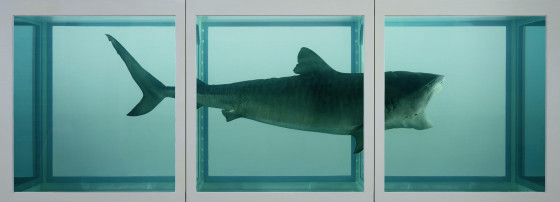
But, of course, the shark was there before Damien Hirst. So he’s just made use of this image, and he’s put it in formaldehyde in an enormous tank, about one-and-a-half times its length in dimensions. This sold a couple of years ago to a very, very rich American with obviously much more money than sense for 12 million dollars or, as the media pointed out here, 6 million pounds. It is always remarkable how that figure keeps coming up again and again and again in the most unlikely contexts imaginable.
Now, formaldehyde will not keep this shark, because in actual fact it should have been put in pure ethanol, and if Hirst were a taxidermist he’d know this. And this is a form of taxidermy rather than sculpture. It’s sort of taxidermy masquerading as sculpture, if you like. To keep the shark, you should have injected ethanol into the shark and have steeped the shark’s body in pure alcohol. Eventually, over a 20-, 30-, 40-year span — and this case will be shipped back to the U.S. and probably has been already — the shark will reduce in size. It will get slightly smaller and then smaller again. It also will eventually flip over, reverse itself, and float down — reduced in size — to the bottom of the tank. So, there’s an auto-destructive or deconstructive element built into this art. And the reason for this art’s existence, amongst many other factors, is that it is anti-artistic, as people who had it boosted for them by the Sun newspaper of yesteryear partly understand.
Why is it that a significant proportion of our people only know of the artistic culture of these islands through the Turner Prize, which is the post-modernist, minor exhibition which has been boosted out of all logicality and reason by certain middlemen, press, and art dealing/gallery interests?
Now that we’ve looked at this shark, we’ll go to a few other of these works and explore some of the ideas that lie behind them.
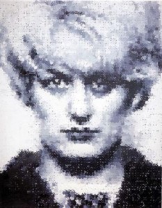
This is an image of the murder and sadist Myra Hindley by Marcus Harvey from 1995. It’s acrylic. It’s on canvas, of course. It’s the same effect as oil paint, but you use water, for the most part. It’s made up, or it’s painted to look as though it’s made up, from small handprints of children. Of course, she was a murderess, with Ian Brady, of children. She has the look that she had in the courtroom, and it’s taken from a press photograph of the era. It’s rather heavy, a sort of pre-Raphaelite virgin sort of look, sort of bottle blonde, sort of lugubrious ’60s semi-iconic image of its time.
Now, Harvey’s used this to be “offensive,” to be anti-bourgeois, to be truculent, to make a pathetic little statement of rebellion, which many of these people are very keen on. He’s done it to be “outrageous.” Many of these images, which are taken from Tate Modern, late Tate Britain, Serota-influenced Turner Prize art of yesteryear — because some of this stuff goes back the better part of a decade and a half now — is part of a movement that is against art as traditionally understood. It’s sometimes called anti-art. It’s essentially forms of conceptual art which are an attack upon what people like, an attack upon bourgeois and middling notions in art, an attack on that which is considered passéiste or outside of that radical cutting edge of modernity, although I would argue that a lot of this stuff is not particularly avant-garde because it’s been done before. The idea that by painting a murderer you actually do something offensive, because the murderer is an outsider in relation to bourgeois order, relates to libertarian and liberal Left views of crime where the criminal is considered to be a rebel against the social order.
Here’s Myra Hindley, championed by Lord Longford for many a year, although whether he’d have approved of this particular image or not is debatable. When I met Lord Longford a long time ago, he said to me, “I love Myra Hindley.” “I love Myra Hindley,” he said, and I said to him by way of reply, “Do you really? Couldn’t you find something better? A better object for the nature of your affections?” I said, “What should have happened to Myra is she should have been hanged in 1962, and that would have been an end of it.”
But here we have this image by Harvey of an offensive sort, and when it was exhibited in the Sensation exhibition at Burlington House in Piccadilly where the Royal Academy is, they had to hire various gorillas to guard it from people who were throwing or attempting to throw eggs at it, which was all rather amusing. They also had an exclusion zone, like a hockey pitch, whereby they painted a white square in front of the image, so that people who stood beyond the boundary of this square couldn’t, if they threw an egg, given the parabola of the egg, get to the picture. So, that was rather exciting.
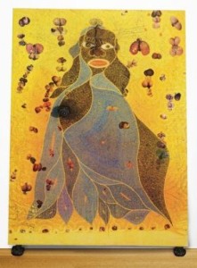
This is The Holy Virgin Mary, a Catholic and iconic image, of course, from 1996. Again, another Turner Prize winner/exhibit. This is by the African, I believe Kenyan, artist Chris Ofili. This is a black, bloated, alleged Mary, mother of God, with a sort of sex doll-like mouth, covered in elephant dung. The elephant dung is real, and he obtained it from the elephant enclosure at London Zoo in Camden where ordure was deposited. He allegedly crept up when warders weren’t looking and shoveled in several black bin liners full of this ordure and later attached it to these canvases.
One of these works was bought for something like £20-30,000, something like that, certainly less than 50,000, by Chris Smith, MP. Chris Smith was the first Labour arts minister after Blair’s landslide in 1997. It wasn’t widely known outside certain metropolitan circles, but Smith, who’s been an “out” homosexual for a very long time now, has been “living with AIDS” for the better part of 20 years. So, given that retroviral drugs take up at least £20,000 a year of one’s money in order to expedite the possibility that one doesn’t develop AIDS and green lupus, an infection growing out of one’s skull and this sort of thing, the combined price of Ofili and the retrovirals is obviously quite significant in the Smith mélange.
This is an image of Tracey Emin’s bed — My Bed — from 1998. She’s never won the Turner, although she’s come close and is one of its most “controversial” figures. An Anglo-Turkish girl born here, she basically with this piece is attempting what is called in this anti-art tradition the ready-made. One of the points about this type of art, and she’s attempting to use certain quasi-feminist clichés during its adumbration, is the fact that it’s not new. Hardly any of this stuff is really that original, because the ready-made begins with Marcel Duchamp in 1920–1921, where he goes into a gallery with a urinal, one of these small ones, and says, “Prove to me it’s not art!” And it was later included as a “ready-made” in gallery spaces.

She is essentially, in a rather sort of chick lit way, revisiting this territory and reportedly says that it is reasonably original. She is also, it’s important to point out, part of a generation of so-called Brit Pack artists who emerged in the 1990s. Gavin Turk, herself, and Damien Hirst of shark fame/infamy, were actually a particular generation of students who came out of Goldsmith College of Art superintended by one particular art lecturer in South London. So, they’re very much this rather in crowd, who, for a while in the ’90s, became a going concern both aesthetically and commercially.
There was also a very minor interface with the Blair regime. In the early years of the Blair government, there was this doctrine, half-articulated, of Cool Britannia, which consists of a large number of allegedly cool and happening metropolitan persons who were gathered around Blair and Co. to make them look funky and sort of down and real and “with it.” Nearly all of these types, of course, have been alienated and estranged by the course of New Labour and, in particular, the Iraq War.
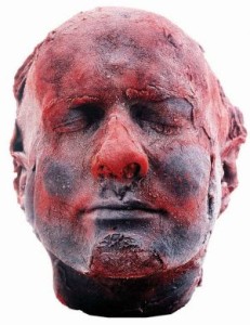
Here’s an image of a mask of blood just called Self, again from 1991, similar era with all of these works, by Marc Quinn, a conceptual sculptor from Liverpool. Now, Quinn is slightly more interesting than many of the other Brit Pack artists, so-called, although he wouldn’t really care for me pointing it out particularly on behalf of a cultural video produced on behalf of the British National Party. Quinn is actually a slightly traditional artist in the sense that he’s looking back. Although the head of blood, refrigerated so it keeps its shape, appears to many people as sort of garish or ghoulish or in poor taste, the death mask goes back to the ancient Greeks and is part of Western culture.
When Beethoven died, an extraordinary mask was taken from him in death showing the power of the man — a power that few of these artists could come anywhere near replicating. But also Keats when he died, an Italian took his death mask. It’s a very old tradition in our culture, because he’d taken a mask of himself while living. And in a way, Quinn is hinting at going back, but only in a deconstructive way, only in a way that’s fashionable with his liberal friends, only in such a way as he can get his work on at the present time, and his work certainly gets on.
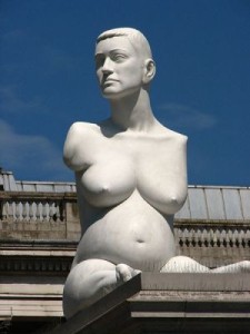
A crucified ethnically disprivileged Christ figure is one of his previous efforts, and if you walk around Trafalgar Square, which a lot of people do, at the present time you will see an enormous sculpture at one end of the square looking out upon the National Gallery as it were, and this is 13 tons in weight. It’s of a pregnant thalidomide victim called Alison Lapper.
But even this, you know, relates to certain classical orders in sculpture: it’s linear, it’s representational. A lot of sculpture in the ancient world, of course, has limbs missing because they haven’t survived. Some ancient, pre-Hellenistic and pre-classical forms of tribal and aboriginal art in the Western context show enormously pregnant women, because, like the Venus of Willendorf, they are actually figures of primitive fertility and usually relate to religious fertility rites of one sort or another. So, in a sense, Quinn is playing games. A lot of these people are. He’s bringing certain things back from the past in a way which is acceptable to Ken Livingstone’s London.
Ultimately, this society cannot decide what to do with the empty plinth in Trafalgar Square, because you can’t have a hero. You can’t have a military figure in this post-modernity on that plinth. Why? Because it’s considered to be conceptually fascistic, that’s why. And that’s why they have pregnant thalidomide victims instead.
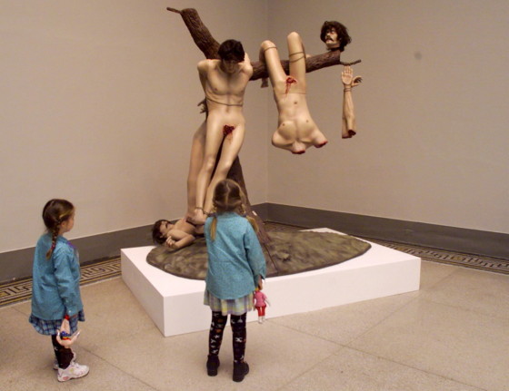
This is Great Deeds Against the Dead from 1994 by the Chapman brothers, who have a concept called Chapman World. Those who don’t like grotesque abattoirial nudity should look away, and don’t put it on pause either. This is based on Goya from the Peninsular War, because the French committed a large number of rather savage and atrocious deeds in the Peninsular War when we fought with the Spaniards against them. The Chapmans are making a point about futility, folly, the morphology of the human. It partly does draw upon the classical tradition actually in a sort of abbattoirial way. It means to shock, but it’s actually more redolent of savagery and heroic cruelty than much of the rest of this art, and it actually, unlike a lot of their stuff, has more to do with the genuine Western tradition. It’s offensive, but then again there’s going to be plenty of severed bodies in Iraq.

This is an image of two American tourists from the late ’80s. Life-sized, obese Americans with cameras in tow, looking on, shopping in hand, slightly arrogantly wondering what all these foreigners are doing when they themselves are, of course, abroad. There is a certain truth to this one, and it is not disagreeable. This phenomenon is known as the ugly American abroad even inside American mass culture. The American embassy has distributed literature to hundreds of thousands of American tourists all over the world trying to get them to say “please” and “thank you,” trying to get them to behave a little better abroad. This rather redundant and middling piece nevertheless has captured something of that.
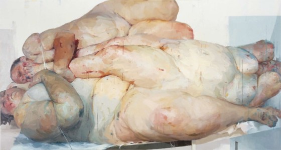
Lastly, this is a radical feminist image of a sort by Jenny Saville. She specializes in unattractive female nudes in various abattoirial postures. She thinks that a glamorous sort of page 3 image of a woman is in actual fact a desecration, and she’s into the depiction of militant female ugliness as an anti-heterosexual, anti-bourgeois, anti-phallocratic, and anti-family statement. So, what do we have to say about this? Well, these bodies essentially are like bits of meat in an abattoir really, which is a surrealist tradition that goes back to the beasts in the ’30s and the ’40s who used to paint in abattoirs to get the right savagery, to get the right sort of effect. But in the end, Saville is just producing images of ugly women that look like trussed up abattoirial specimens. So, it’s the sort of pictorial equivalent of Andrea Dworkin’s ideology, writ in paint, in ugliness, in obesity, in it’s unattractiveness to men, as a mute and futile statement of the absence of motherhood.
Now we’ve had a look at quite a few Turner Prize images, Tate modern, late Tate Britain images.
What is this art about, and where does it come from? Also why has it been pushed particularly by a mass market tabloid newspaper like the Sun of all things?
To deal with the things in correct order, these works come out of conceptual art. Conceptual art is an art movement that pretty much began in the 1960s, but there are antecedents further back in modernism. Modernism is a very old idea and goes back to the middle of the 19th century with the impressionists. This type of anti-art comes from the ’60s but relates to a movement which was in protest against Western civilization at the end of the Great War.
This movement was named after a sort of child’s gurgle and was called Dada. Da . . . da . . . da. . . Dadaism! Yes. And this movement, which flowered for a brief, brief period as Weimar Germany in particular was coming in just after Germany’s defeat in the Great War, late second decade of the 20th century, early 1920’s, had attempted to produce a pastiche of childish, infantilistic art as a protest against the adult society which had led to the carnage in Flanders.
Now, factoring forwards about 40 years, the hippie and Left and counter-cultural movement of the 1960’s, best known for its inflections in fashion and music, also had an artistic side. They rebelled against the artwork as object, and they wanted to create objectless art. They wanted to create anti-middle class art, anti-bourgeois conceptual art, which would be totally resistant to the blandishments of the market. You notice the hypocrisy here, because this image that we have before us now (Hirst’s shark) has just been sold for many millions of pounds and dollars depending.
Over time, that which was ugly, fierce, deconstructive, melted down, against the grain, against society, against traditional taste, even within modernism, has become acceptable, and it has become in turn a vehicle of exchange which can be exchanged for vast amounts of money. And the Saatchis in particular have been buying this work from this post-Goldsmith’s sect for many a long year.
They have a warehouse in Leyton in inner East London that burnt down rather recently, and a cynical Catholic friend of mine rang me up after this warehouse had burnt down with a lot of this stuff in it and said, “You know, there is a God.” What he was trying to say by that it was a sort of righteous vengeance for all this. But, in actual fact, at the material level of existence, it was some faulty electrical fitting which caused the thing to burn down.
One of the exhibits that burnt down was an enormous array of sort of quasi-pedophile dolls which were arranged by the ubiquitous Chapman brothers as part of their Chapman World. When I attended the Sensation exhibition at the Royal Academy in Burlington House, Piccadilly a couple of years ago — this was the one with the crowd outside and the demonstrations against the Myra Hindley image and so on — I noticed that there was a sign before you entered an inner section of the exhibition; this related to the Chapman World’s efforts, because you had to prove in a sense, at least conceptually, that you were over 18 years of age before you’d go on and see these allegedly shocking images and that sort of thing.
But, in actual fact, it’s all unoriginal stuff, because this was done by Bellmer in the 1920s and ’30s. He was a surrealist, who in a mute protest against a certain German regime that then existed, produced a large number of naked female dolls in various poses. It relates to Balthus’ paintings as well. So, there’s a degree to which none of this stuff is original. The shark is a return to the ready-made of Duchamp and later of Warhol, so is Emin’s efforts her unmade bed, her anti-art, her scissors that won’t cut, the sort of camping tent that consists of the names of her aborted fetuses and all the men she’s slept with, and so on and so forth.
It’s actually recidivistic material. It’s a dog returning to its own vomit, if you pardon the phrase. All of these sort of things have been done before and partly done to death. There was a pop band, I believe, called Pop Will Eat Itself. And there is a degree to which this is post-modern art devouring itself, returning to various sources early in the century, deconstructing itself, acting against its own tradition, rather like many of these contemporary operas where, you know, they had Don Giovanni, but then they put a toilet on stage because they’re “acting against the piece,” it’s called.
But they’re doing so because they’re bored, because they haven’t got anything to say by virtue of the fact that they’re sort of liberal and decadent. And it’s less the modernism of style and finish than the valuelessness that lies behind it which has to be our source of critique.
You may now feel that we’ve done the Turner Prize to death, but not quite because in our talk about the negation of the aesthetics of the Turner Prize and related Brit Pack artistry we are now going to turn the clock back to go forwards. The important point about the Rightist attitude towards modernity and modern art is not to be “reactionary.” One should not reject the modern. One should change the vortex and the system of values and energy that lie behind what’s ended up with turds in boxes, which is actually an artwork in the 1970s by a so-called conceptual artist named Manzoni. An Italian-American heiress bought his own ordure in a gilded box for 7,000 dollars U.S. so that in Rome she could, actually rather dolce vita-like, say to her decadent and sophisticated friends that this is what she had done. But we wish to move away from that towards radical, but traditional art. And there can be nothing more radical and nothing more traditional in our conspectus of new against old and rival forms of modern artistry, albeit historically displaced, than church gargoyles.
These images, which sometimes are called corbels in Yorkshire and which influenced very strongly the young Henry Moore in their three dimensional form, are post-medieval images and medieval images in turn. They are to ward off evil spirits mythologically. They are powerful. They are on the interface of ugliness and beauty, which is part and parcel of the modernist aesthetic per se.
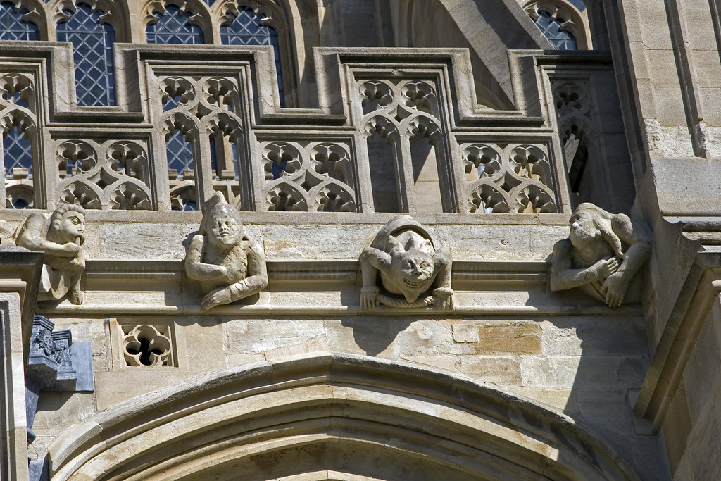
In this particular image, which is in the Royal seat at Windsor at St. George’s chapel on the exterior, we see an anthropomorphic figure partly lion-like, semi-animal/human, wrestling with a fetus, wrestling with a child that’s partly under its arm. Is it guarding it? Is it throttling it? Are they both crying out? Are they in pain? Or are they in joy?
Now, this is a very powerful image made by an artist working in traditional church art and the craftsmanship and genuine artistry of the post-medieval interior and exterior. It’s a superb piece of art. We will never know the man’s name, but this piece of work is far more important than Hirst and Turk and Emin and some of Quinn’s and many of the others.
There are thousands of these images in our churches up and down the land. It is an image of power! It’s a threnody. It’s visceral. It’s ten times more powerful than anything these Turner Prize people can produce, and why is that? It’s because it’s based on belief, and it’s based on a semiotic of meaning, and there are values that lie behind it that reach into the depths and come out from them.
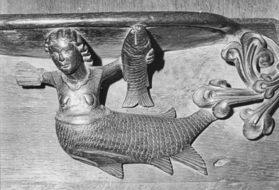
This is another image from tradition which is more radical than that of alleged modernity. It’s a mermaid holding a fish on the exterior of Exeter Cathedral. Again, one sees a strong image of powerful femininity rooted in medieval craftsmanship. Many of the men who produced these sorts of images wouldn’t have considered themselves to be artists, but they’re actually very great artists. And it puts Jenny Saville and her ilk into the shade. The reason is that it relates to canons of preconceived aesthetic beauty, female beauty perceived heterosexually through the male eye. And don’t forget, this is on the exterior of a church, so one has erotic mythological imagery of a heterosexual character as part of the tradition in stone of conceived Christianity.
The difference between it and the Turner art which we’ve had across this screen in the early part of our talk is that these images are rooted in belief. They exist in the mind of the artist prior to their execution. If they don’t draw them prior to the sculpting of them, they’re drawn mentally in their own mind. They proceed to the object. They’re pro-object. They are object-friendly, and they believe in objectification. It is not, as Metzger would say, “Art against the object” or auto-destructive art as his little movement, essentially confined to himself in the ’70s, testified to.
So, we have here the inverse of the Turner methodology both in its praxis, in its prior beliefs and the form that it comes out with. And, in the end, it ends with an object, which although it may not be to everyone’s taste, relates to the instinctive understanding of beauty as conceived by the majority of people.
This is a rather dragon-like or reptilian gargoyle head from a church in Yorkshire (Figure 12: Gargoyle from Hedon, Yorkshire missing). It’s a sort of form of white aboriginal art virtually by a craftsman who is totally unknown. It’s from Hedon. It’s described as the termination of a stringcourse, but it will be outside of a provincial, probably rural, church facing downwards, looking ferociously at somebody who is looking up. It relates to a sort of antithetical principle really, sort of evil to ward off evil in a way. But it’s a figure of quasi-satanic majesty put on the outside of a Christian church by a northern craftsman and artist of genius, because that’s what these corbel sculptures were. Make no bones about it. These men exemplified the Gothic tradition, and they exemplify Flemish art transplanted to the north of England in stone and in three dimensions on the outside of our churches.
When modernists of a Turner Prize sort, but not of the sort which could be characterized by a Lewis or even a William Roberts, talk about power as beauty they should look at images like this.
Here’s a monkey whipping its young on the York Chapter House (Figure 13: Violent monkey, York Chapter House missing). It’s a superb image, a sort of truly silent version of King Kong and in stone several centuries beforehand. It’s a sort of deeply anthropologically knowledgeable image. The form of the beast is correctly captured. It’s sort of an imp of the perverse image. Don’t forget, the monkey in this configuration is completely pre-existing any evolutionary theories that might look at higher primates and simians in a different way than this sculptor looked upon them. But it’s another of these grotesques and images of European fantasy on the outside of our churches in traditional cities like York. Looking on, beating its young, an image of the primordial, of the powerful, of the most savage, of that from which we have come.
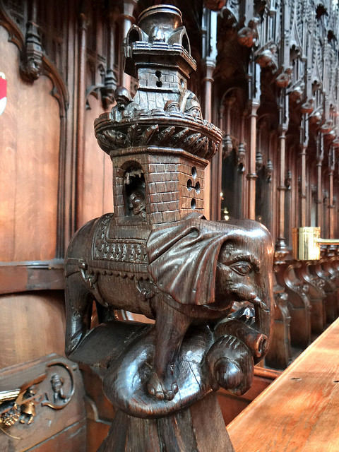
We now move from the outside of a church or cathedral to the inside. This is in Ripon Cathedral, and it’s an elephant with a sort of traveling house on top of it, a sort of canopied structure on the back of the beast that humans and other goods could be carried in. It’s probably influenced by Clive’s forays into India. There’s a sort of post-imperial feel to this piece. It’s on the edge of a row of seats or pews inside the ??? of Ripon Cathedral. The interesting thing to me about this image is the imagination that’s gone into it. It’s the delineation. It’s a piece of white aboriginal art in a way. It’s fierce. It’s visceral. It’s militantly three dimensional. The thing is alive. It’s protean.
When Henry Moore from Yorkshire was very young he went to see Wyndham Lewis in the 1930s, and he said to him, “What’s sculpture about?” And Lewis said, “Have no fear. Relate to the past. Be aware of past precedents but create for yourself in the time when you’re alive. Believe that all is plastic under your vision, and you can change the world anew. Think only of power and beauty in form.” This elementary and elemental sculpture of the elephant in wood inside Ripon Cathedral has it.
This is a more abstract piece in many ways. It’s slightly florid (Figure 15: Caterpillar, Exeter Cathedral missing). It could be conceived as more feminine, weaker than the others, but it’s still a powerful piece. It’s a caterpillar in its sort of vegetation laid out in a slightly mosaic way, in a slightly patterned way. It’s not meant, in my opinion, to be too clear. It’s slightly serene and also slightly surreal. It’s also strongly related to the purity of natural form bearing in mind it’s on stone, and it’s outside Exeter Cathedral on one of its walls. It’s a caterpillar in foliage. It’s probably quite a bit better, three dimensionally speaking, than a Turner Prize exhibit such as My Dead Dad.
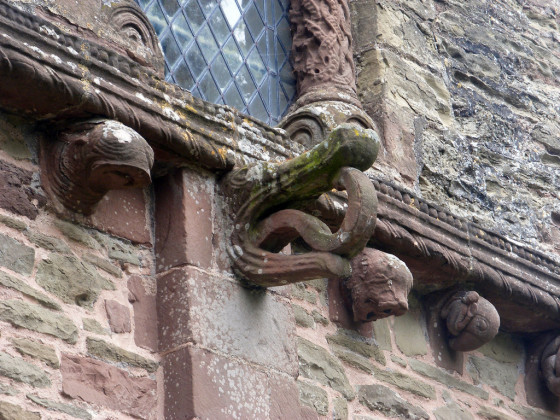
This is an image again on the outside of a church which could come completely from the British Museum, but is ancestral to our art here. It’s a crocodile head from Kilpeck in Herefordshire. It’s almost abstract in a way in its power, in its delineation. There’s a hint of what in classical art would be called the worm ouroboros. It is the snake that devours its own tail and is a serpent within a circle of fire and represents a primeval Indo-European racial and cultural symbol. There’s great power in this imagery as the head comes out of the stone in one way, reflexively, to devour. In the culture which it originates from, the crocodile is a serpent, is a dragon, is a snake, represents the snake in the Garden of Eden, represents knowledge, fulfillment, desire, eros, and the choice that humans have to make in this life.
Here’s another image which is ancient and yet modern bearing in mind that a lot of these monsters depict the “horrid,” but they do so from the perspective of the 12th century imagination (Figure 17: Monster from York Museum missing). So, we’re looking at work which, give or take the odd hundred years, is a millennia old. It’s a thousand years old, yet it springs out fully formed. This is a monster from York Museum. You see a man with a club fending off various demons of the dark nearly always configured in reptilian terms. The reptilian part of the brain, if you believe in evolutionary brain theory, is devouring the individual in the 12th century imagination. The mouths come out. The body of the sinner, as it were, is devoured and carnivorously ripped asunder, although the delineation in this piece of three-dimensional relief refers to the soul and to the spirit of man corporealized, seen as a body, on the outside of a church, now inside of a Yorkshire museum.
Yes, here’s a sort of horror video of its time in a way (Figure 18: Vaulting boss from Alston in Gloucestershire missing). It’s a vaulting boss from Alston in Gloucestershire. You’ve got four interconnected heads here around a sort of Celtic cross, an interconnecting nodal point from which their sort of skull heads radiate. You can see the mouths. You can see the teeth. You can see the eyes. They’re gruesome, they’re grim, they’re devouring, they’re diabolical and yet divine. It’s quite a small space by the looks of it, and it’s carved in a sort of kaleidoscope of malevolent stone. It’s like an image from Tolkien’s The Lord of the Rings, but it’s a thousand years back, and it shows the fecundity of the English medieval imagination.
These are forms of traditional primitive art (Figure 19: Angel, Kilpeck missing). This one, which represents an early angel, represents a sort of powerful chthonic early image of an angel based upon Romanesque precepts. There seems to be an eagle or a bird of some sort above it. The eagle cosmologically often represents the superior part of the spirit soaring above. You’ve got the angel with a sword. It seems to be fighting with a creature. You have the wings coming out of the back of the angel. It’s very much in stone relief, the sort of art that existed in the catacombs from whence Christianity emerged to take the Roman Empire and then the Western world. It’s from Kilpeck. And it’s yet another of these examples of primitive art which in its power of statement far exceeds post-modern primitivism and post-industrial primitivism, which doesn’t believe in anything.
Yes, this is an image inside Coventry Cathedral as it was (Figure 20: Angel with Harp, old Coventry Cathedral missing). It’s now destroyed, of course, because of the bombing of Coventry during the war which decimated the cathedral and forced post-war planners to rebuild it. Now, in this image, to concentrate on this first, we see a sort of rather avuncular angel with its massive wings like an eagle bursting from its frame on either side, possibly playing a harp here, given the plane of the instrument to the body. Wide-eyed. The eyes have no eyeballs. Alive, vigorous, very powerfully present and three dimensional. Poised. A certain repose, but almost a certain jocular aggression.
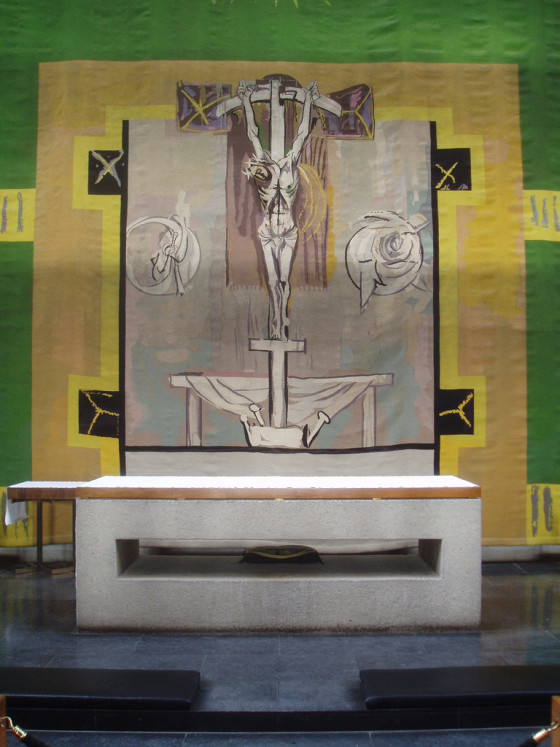
Now, there’s an interesting story here because when Coventry Cathedral and environs was destroyed, it was rebuilt along essentially contemporary lines, lots of concrete used in the new cathedral. Graham Sutherland, a figurative and anthropomorphic artist who melded shapes in nature together to produce reliefs in the ’50s and was a rival to Bacon for artistic preeminence within modernism at that time, produced the stained glass for the new cathedral. And a woman who was apparently some slightly crazed Christian believer came up from the south coast with a hammer to the Midlands to attack this object, the crucifixion, a staple of Western art throughout two millennia, because she didn’t like the look of it, because she considered it to be a desecration.
But the idea of Sutherland being a bit of a desecration is in contemporary terms a bit of nonsense, because Sutherland relates to primitive art traditions that go back to these medieval carvers and stonemasons and workers in the three dimensional. Because his images of the Christ are images that pre-date early Renaissance art. They’re Romanesque; they’re Byzantine; they’re Gothically primitive. They are white aboriginal pieces of non-classical refinement.
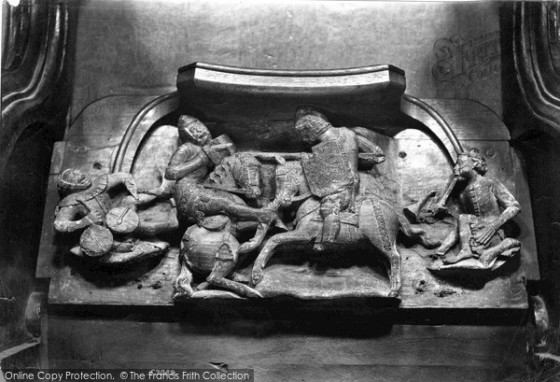
Here’s another ancestral and traditional English image. It is from Worcester Cathedral. It’s entitled The Tournament. It’s a relief, of course, because it’s not three dimensional in the round, so you look at it one way on. It’s a joust. If you’ve ever seen the 1950s Hollywood film, quite a good film, Ivanhoe of Walter Scott’s epic, you’ll know what I mean. We have the two warriors fighting it out within the context of Christian dominion. Possibly there’s two ladies, maybe, on either side, or they’re warriors who are fighting on behalf of women who tie their ribbons to the lances. Even if the lance goes through one of them and pins them to the heart, they’ll have a sort of grand dame’s ribbon on the tip.
So, we have here glory, the heroic, the masculine, the violent, the English, or at least the post-Norman in the context of a religion of peace. Because it is important to understand that the medieval period and thereafter was not a dispensation of Christian humanism. It was a traditional Western and organic society whose belief system, semiotically, was Judeo-Christian. But this type of warriorship pre-dates Christianity and is there at the very beginnings of our culture and, of course, in the better traditions of even the contemporary armed forces still exists.
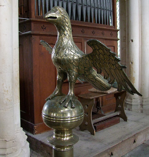
This is a powerful, a primeval and a triumphant image. The eagle is cardinal to Western civilization. In Nietzsche’s Thus Spake Zarathustra, the archetypal Aryan Persian mystic, Zarathustra, the originator of Zoroastrianism, has two pets. One is an eagle, and one is a serpent. This goes back to ancient Greece where the gods, in particular Zeus, the primary god after the overthrow of the titans before him, has pets like an eagle, that symbolizes courage and partially masculinity, and a snake, which symbolizes partially femininity and knowledge, because in this life all you need, deep down, is courage and knowledge.
Now, this is in St. Wiggenhall Church. It’s part of a brass lectern, a divine would have stood next to this, alongside it and given a Christian oration. One sees in all of this art the narrative of Christianity unfolding through replication of primeval Indo-European imagery in an English and British context. But you have to understand that this type of Christianity is very much integrated completely into the doctrine of the Western civilization. And obtruding out of it in a heroic image like this, no matter how Christian the context, is the paganism that went before.
Here we have an interesting and rather paradoxical image from St. Alban’s (Figure 24: Abbot’s heraldic device, St. Albans missing). It comes from the 1500s. Are they heroic sort of rearing sheep? Paradox upon paradox. Or are they sort of Romanesque and rather half-formed lions, which don’t particularly look lion-like or who knows? But they’re interesting rearing creatures on either side of a heraldic motif for a late abbot. The eagle again appears triumphantly, claws out, wings distended. It again shows this sort of heroic and martial element even for a dead cleric in three dimensional stain work of early modern, and approaching the Reformation, Christianity.
Here we have a traditional heraldic device in stone. Margaret Patton’s London (Figure 25: Lion and unicorn in stone missing). The lion and the unicorn, traditional images of the royal house and of England. Heroic. Mythological, of course, in the case of the unicorn. Rearing, symbolizing the union. Florid, there’s a sort of baroque and even rococo feel to the thing. It’s deliberately stylized, deliberately ornate. Fierce and it’s exaggerated in the splendor it is displaying. It’s almost like a patriotic peacock display in stone. It’s a relief, but it has certain of the energy and solidity of a three dimensional work that you can actually walk around, because it fills its own space and extends from it.
Now, with all of this traditional material that we’ve been looking at as a response to the Turner Prize formulations of earlier in this talk, we are attempting not just a reversal, we’re not just being reactionary in liberal terms, going back. We’re going back to go forwards because when you look at this art you realize it has far more energy, far more life, far more vigor. It’s more alive, even if it speaks to us across half a millennium or a thousand years and more. Why is this? It’s because, as I have already intimated, it’s pre-formulated, it comes out of an organic culture. The artist expresses racial essence through cultural form. It has a dynamism and a vigor and an arrow which shoots into the future.
One doesn’t have to be a Christian at all to appreciate it, because Christianity was the narrative and the semiotic of our culture. When our warriors went abroad; when they killed foreigners; when they did what was necessary for this country, they had a cross on their shields and on their jerkins. But they were pagans who had a cross. And this is what this Christianity really means and is.
This tradition has now died. And one sees in the deconstructive art of modernity and late modernity as exemplified by the Turner Prize a sort of anti-Western tradition, a sort of narrative impulse which is against the bloodline of our own history and identity. Doesn’t portend to all of these works. There is some quality to some of them in a nuanced way. Some of them are hinting to elements beyond themselves, which I personally see in the work of Quinn, amongst others.
But they would have to go back to go forward. And they have committed the cardinal mistake that much of ??? and development for classical art as was. Everything has to be renewed just as Rodin, the great French sculptor, renewed neo-classical art at the end of the 19th century by injecting into it impressionist movement. This art can go on, can be reinvigorated, but it involves the British people, the English people, and their intellectuals and artists, in particular, recovering their spirit and recovering their dynamism as a people to go forwards into the future.
Art is the creation in objective form of the spiritual nature of a people. A people is essentially a racial grouping, even though the English are not a race nor are the British. We are a part of the Indo-European or white race, which is a polarity within the overall anthropological designation of the pale. We are a race, and then a culture, and we culturalize ourselves through nationality and through a feeling of belonging. The more English you are, the more British you are. And the more British you are, the more European you are, which has nothing to do with the precepts or bureaucratic structures of the so-called European Union. And the more European you are within a hierarchy of values aesthetically and biologically, the more Indo-European you are.
With this art that we have looked at as a volte-face to the Turner Prize super-imposed upon us by the semi-artistic dictatorship of Serota and his ilk, we see a prior world. We see a world which pre-existed much of what has occurred since the Second World War. It can exist again. It shall exist again. It exists within the genetic makeup of the British people. All we have to do is to reach into the present with the many talented artists who exist at this time. It’s quite a mistake to think that they don’t exist at this time. Some would have it otherwise, but the contrary is the truth. We need to wrench from the artistic presentation of the present the folly that exists within most of the exhibits that come forward under the banner of the Turner Prize. Let us return to tradition to go forwards with modernity in a different direction.
